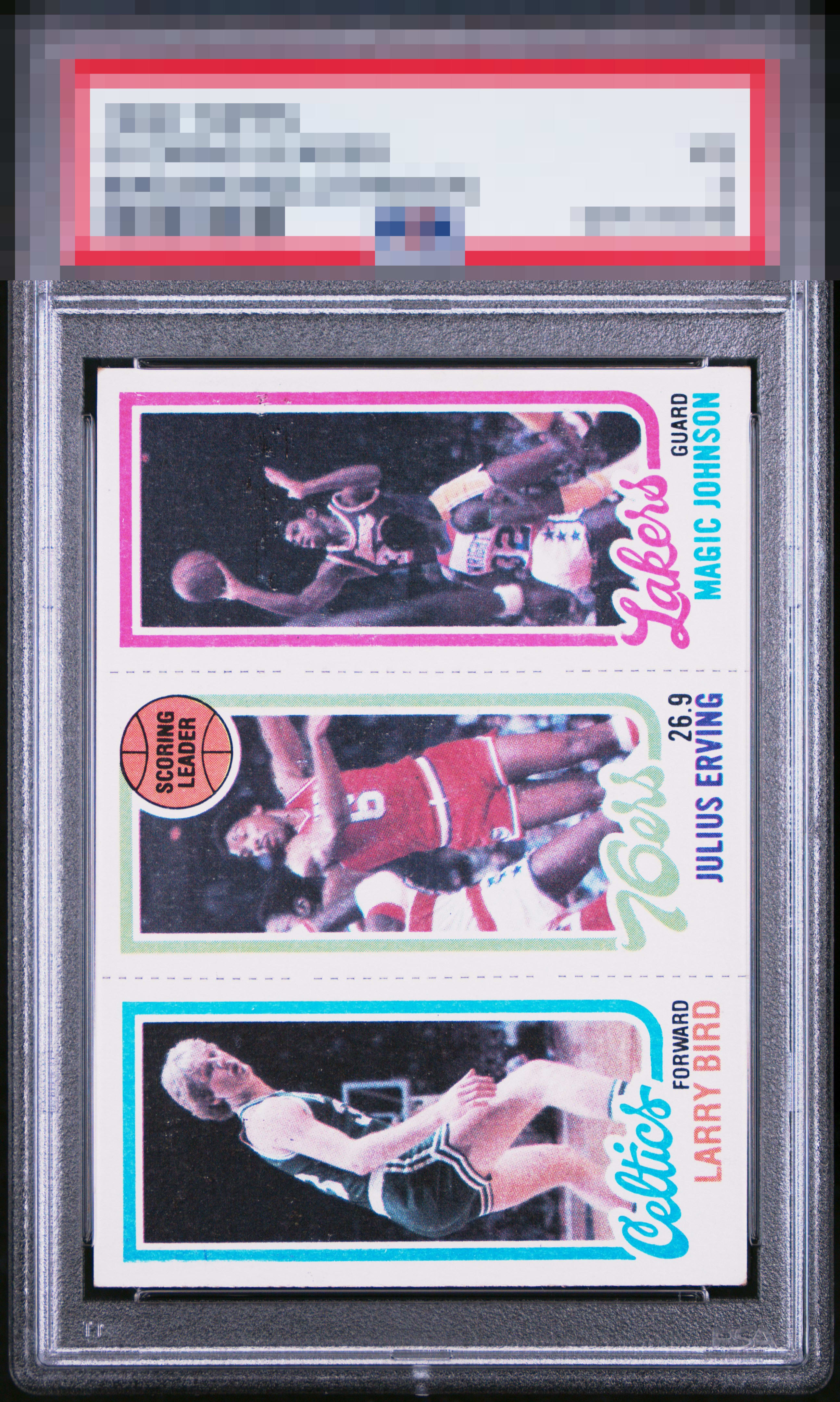
1980 Topps Bird, Erving, Johnson

Reviews & Discussions
9 total reviews

Centering is a standout feature of this classic, and my cycloptic eye notes even the perforation lines created centered panels within the card. My understanding is that collectors find this symmetry appealing, as do I. A weakness in color is detected, which prevents higher tier badges.

Centered panels, solid centering, no black line. Some snow and color fade are the issues

Could be the scan settings but the color looks a bit washed for my taste. Otherwise pretty crisp.

I like the centering, though it has the common degree of tilt, and also love when there is no black line on the bottom edge. The PD in the Magic panel and what appears to my eye to be some sun fading cap eye appeal at the B Band in my estimation.

nice and clean and bright card. The centering is ok but the card seems tilted especially in the upper left and right sides if you follow the inner border.

EyeQ+
EYEQ+ TROPHY CASE


Rating Distribution
9 total reviews
No major issues but centering could be a little better, color looks a little faded, and there's some snow in the background. Still a nice card overall