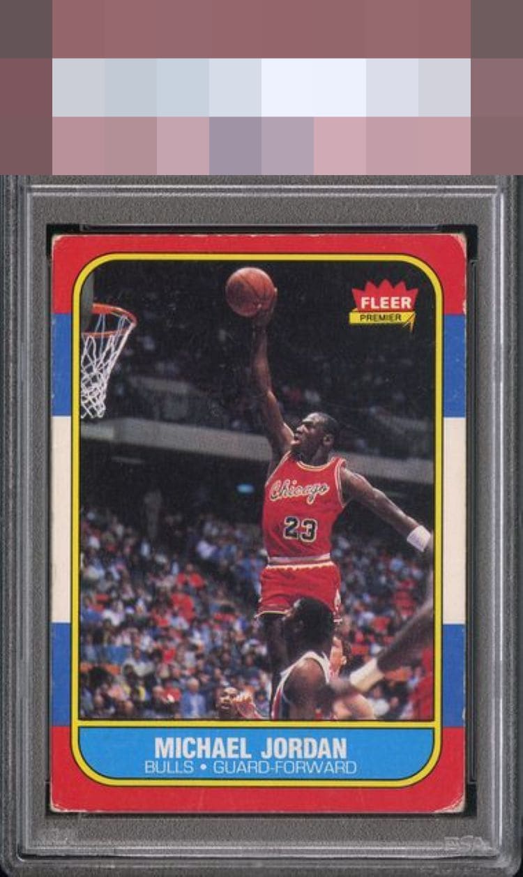
1986 Fleer Michael Jordan #57

Reviews & Discussions
8 total reviews

Well loved corners but pretty nicely centered and image and eye appeal remains attractive. It's a Jordan.

Well loved but decent centering & retains a solid image without much surface issue.

Centering looks a bit off top to bottom and left to right, and while I don’t mind some wear, there’s a bit more than my eye prefers on this one.

This is a good example of what is to me a C+, as there are some serious flaws that of course we'd look to improve if possible, yet those flaws are not paper loss on the subject, a PD or a crease through his face, things that prevent basic enjoyment.

to much wear around the corners and the edges impacts the quality of the colors. The image is good. Still can enjoy the card with its limits

The image looks nice. Too much corner wear for me. If the borders were white maybe I could overlook it but the wear stands out more with the colored borders.
EyeQ+
EYEQ+ TROPHY CASE


Rating Distribution
8 total reviews
Centering better than most with edge and corner issues