1961 Fleer Oscar Robertson #36
1 / 2
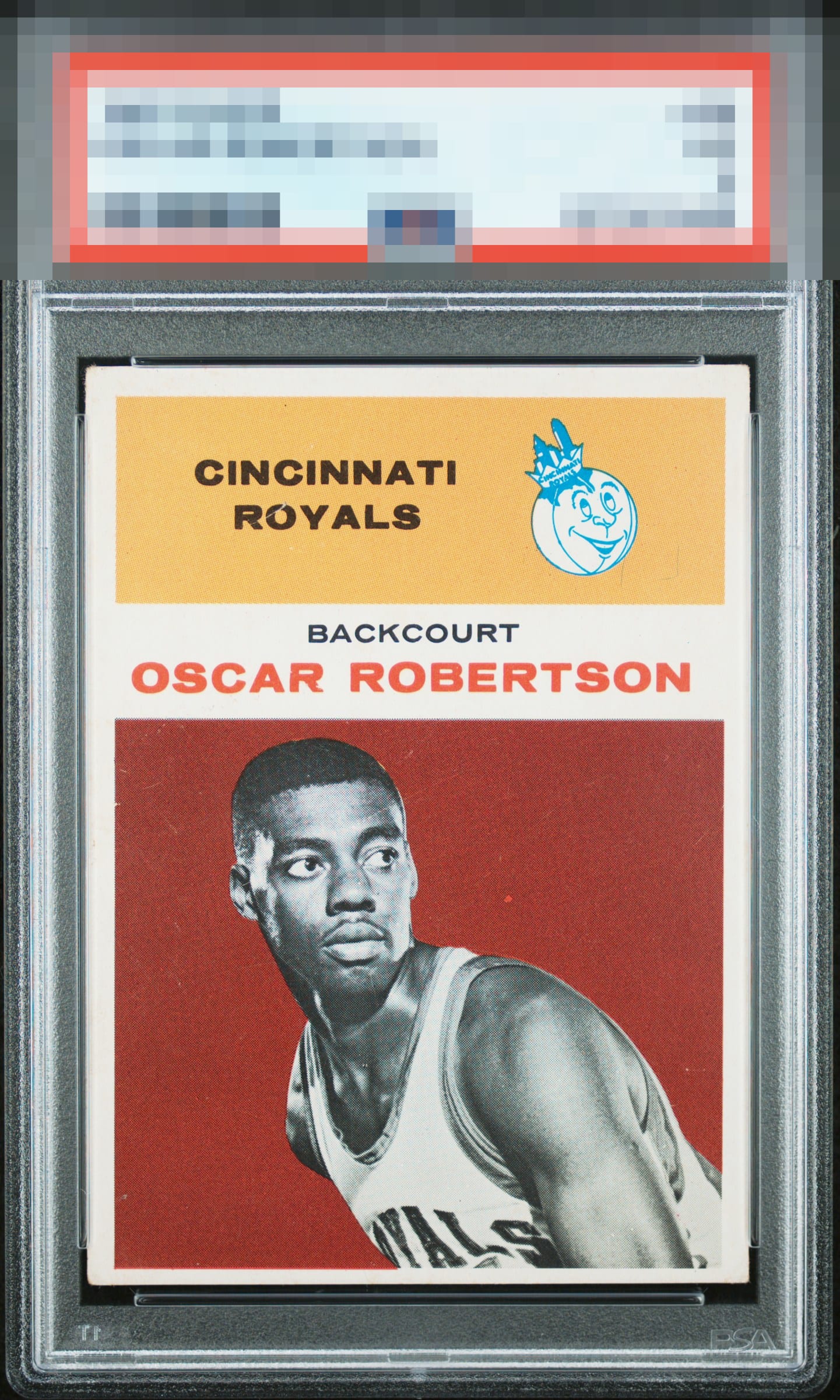
Click to enlarge

💬
Reviews & Discussions
9 total reviews

My cycloptic eye confirms visual appeal of a higher order. Centering is the prime offending aspect, with corners and mild print imperfections logged without prejudice. Well chosen, my human friend.


Card looks great the only flaw is the centering top to bottom.

Has a nice look to it but the colors are not as crisp as i have seen on others. Some surface wear is noticeable (most of it blends in well) but the line/crease thru the RO in Royals stands out to me

The brownish/red background has some blemishes. Centering is off low and a bit to the right. Image of Oscar is nice and focused.
Locked
2 reviews
EyeQ+
129.0
Global Population
4
POPULATION ACROSS ALL GRADES AND GRADING COMPANIES
Global Eye Rank
#3
Population in Grade
1
POPULATION IN THIS GRADE ACROSS ALL GRADING COMPANIES
Eye Rank in Grade
#1
EYEQ+ TROPHY CASE

3rd Place
GLOBAL

1st Place
IN-GRADE
📊
Rating Distribution
9 total reviews
G
0%
A+
0%
A
0%
A-
1 rating
14%
1
B+
2 ratings
29%
2
B
3 ratings
43%
3
B-
1 rating
14%
1
C+
0%
C
0%
C-
0%
D+
0%
D
0%
D-
0%
F
0%
Nice color and image. Centering is the main issue along with a few marks in the red background.