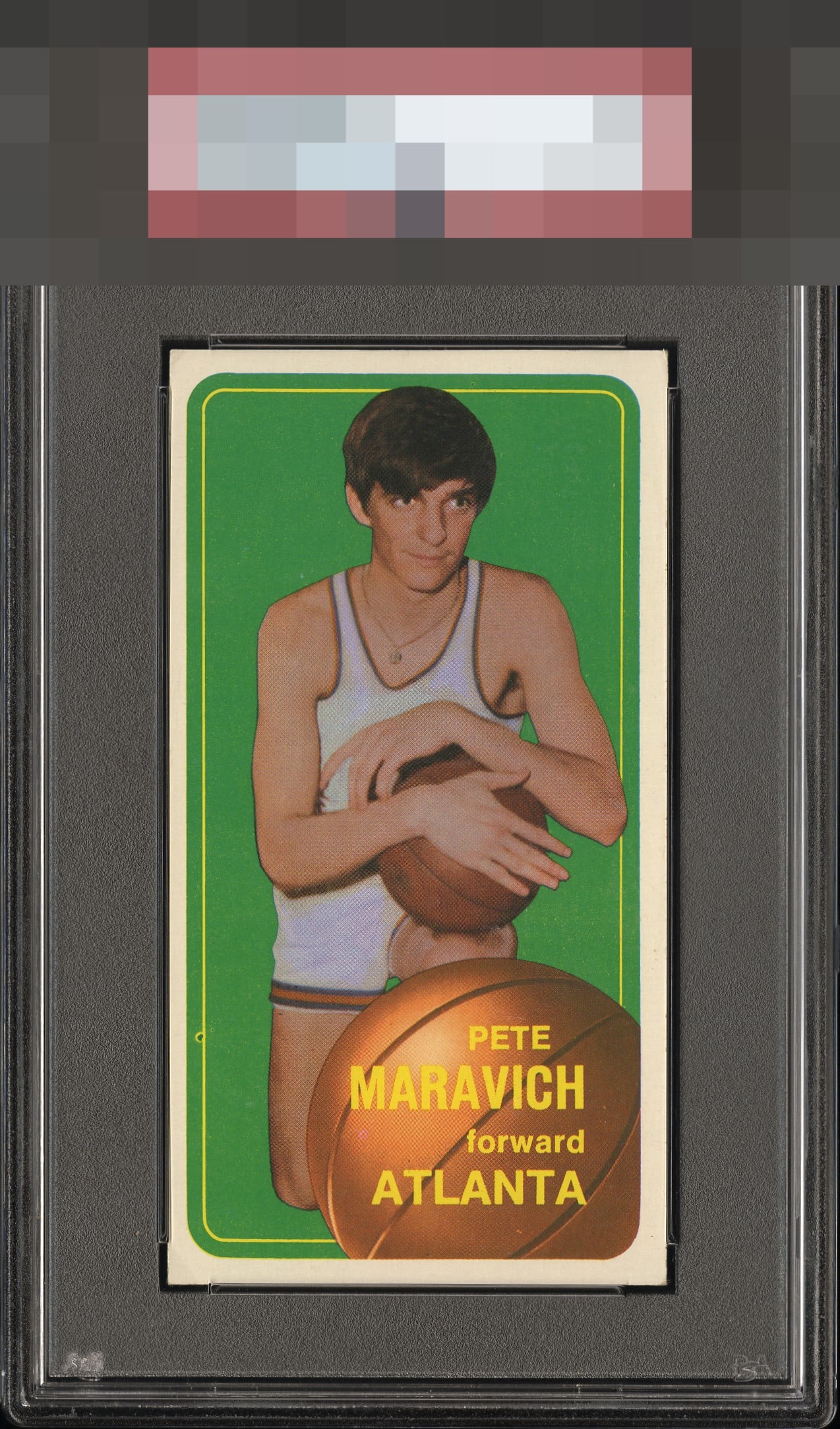
1970 Topps Pete Maravich #123
1 / 2
Click to enlarge
💬
Reviews & Discussions
8 total reviews

Makes a very good overall first impression. A longer look and the centering plus the fish eye bump the eye. Solid eye appeal.

Great color but the centering is off and that fish eye on the left stands out.


Colors and image are off the charts. L/R centering and the fisheye are the only detractors.

love the image and the color and the card presents well it is held back by how the borders poorly frame the card and minor fish eye

Good eye appeal, led by a great image and largely clean green. Centering and one fish eye are all that make impact.
Locked
1 review
EyeQ+
126.0
Global Population
1
POPULATION ACROSS ALL GRADES AND GRADING COMPANIES
Global Eye Rank
#1
Population in Grade
1
POPULATION IN THIS GRADE AND GRADING COMPANY
Eye Rank in Grade
#1
EYEQ+ TROPHY CASE

1st Place
GLOBAL

1st Place
IN-GRADE
📊
Rating Distribution
8 total reviews
G
0%
A+
0%
A
0%
A-
1 rating
14%
1
B+
1 rating
14%
1
B
5 ratings
71%
5
B-
0%
C+
0%
C
0%
C-
0%
D+
0%
D
0%
D-
0%
F
0%
Centering shift is noted as well as a stray print dot along the left border. Card is beautiful with super eye appeal.