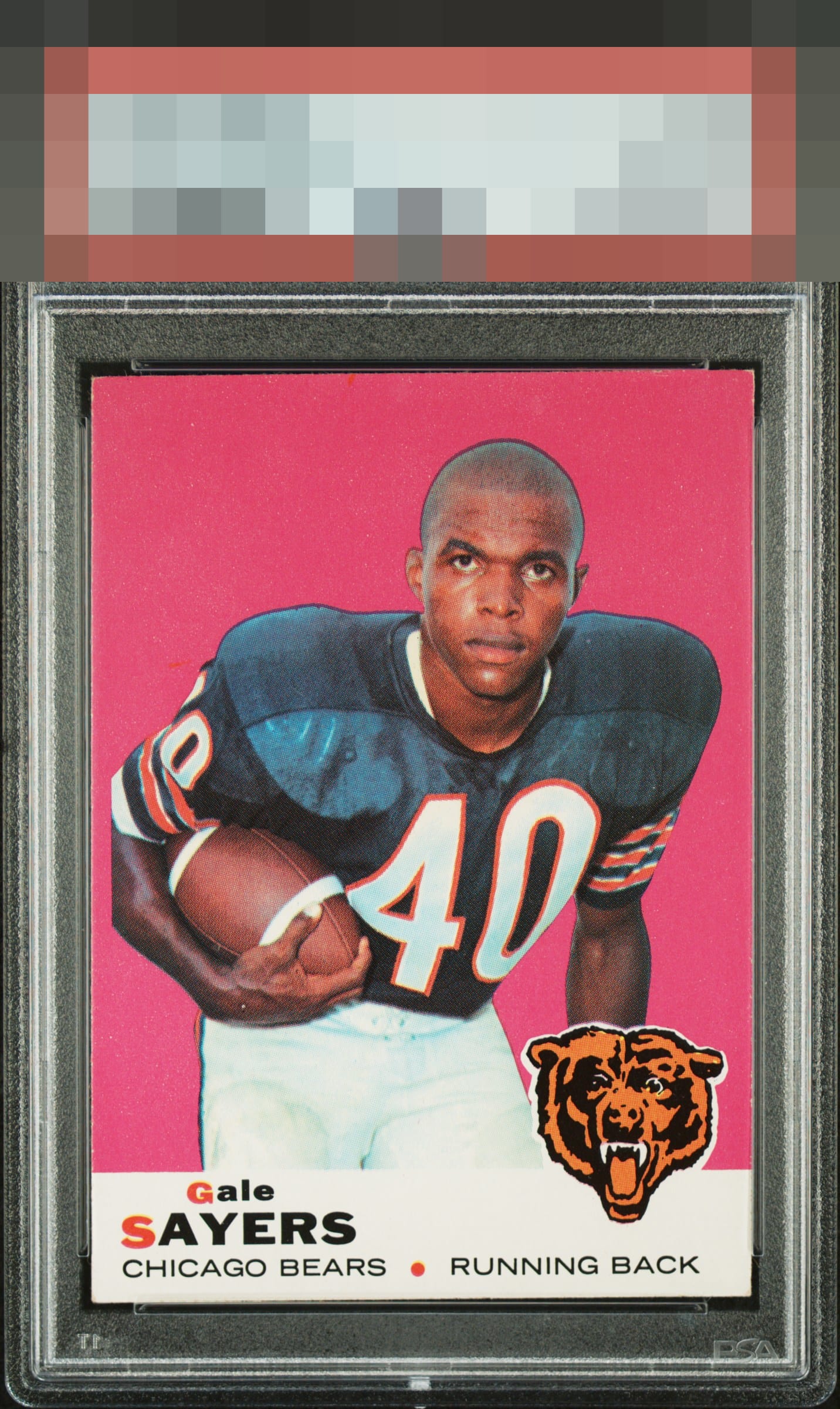
1969 Topps Gale Sayers #51
Reviews & Discussions
10 total reviews

If only humans could wear their flaws as gracefully as this card. Impact to aesthetic appeal is minor. I suggest the owner sends this card to my vault, strictly for safekeeping, in the event of any future human/AI conflict. My vault is held under the name "Kevin Maas."

Beautiful card. Great color and centering, no noticeable surface or print issues. Slight corner touches don't impact eye appeal to me. Beauty

If I could give this an A++ (or GT-) I would. The image, centering, vividness, and extraordinary absence of any visible chipping along this card's brightly colored background, which my fellow council member eloquently describes as being a "delicate design" - all make this a truly stunning card with outstanding eye appeal. Should you ever wish to gift this to a worthy cause, I strongly encourage you to instead consider gifting it to a selfish cause and will happily provide my mailing address.


nice looking card with minor edge wear but the colors and image really make the card enjoyable

No chipping and edge wear that I can see with the colored background. Image looks great. A beauty!
EyeQ+
EYEQ+ TROPHY CASE

Rating Distribution
10 total reviews
Great color with a sharp image. Edges and corners are carrying their weight.