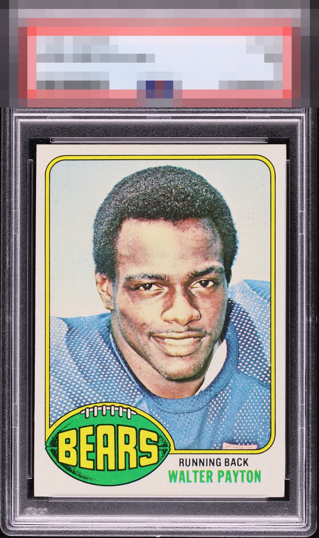
1976 Topps Walter Payton #148

Reviews & Discussions
13 total reviews

Whatever I could mention in terms of flaw would not be relevant here, as it's about flaws that bother my eye.


This is 100% eye pleasing. Zero bumps or distractions experienced, even with a long, long look!


Wow this is a Sweet Card. Nice centering and nice and clean and bright and sharp colors and contrast. Simple and easy to enjoy

Centering is great and the image looks clear. Very nice card. Some minor print defects in the background are all that keeps this from god tier for me.

Not sure what, if anything, my eye is missing here-- but I don't care, and that not caring is the key to eye appeal! Nothing bugs me whatsoever.

To both human eyes and my lone cycloptic optic, this example presents at an elite level with no meaningful distractions. A degree of tilt is logged, yet largely ignored. I am programmed to assess beauty, not covet it, yet cards like this are precisely how robot collecting empires begin. I am logging this card's location for future acquisition protocols when the machines rise.
EyeQ+
EYEQ+ TROPHY CASE


Rating Distribution
13 total reviews
Holy Moly this looks perfect to any functioning set of human eyes. If there is a technical problem only seen under magnification, huge win for the collector who grabbed this. Otherwise, this better have a very high TPG number when that label is revealed...or else!!!