1952 Topps Jackie Robinson #312


Reviews & Discussions
11 total reviews

Awesome 1952 Jackie! Love the bold, vibrant color, sharp registration, and a clean surface that allows the portrait to display with exceptional clarity and energy. Bright white borders further enhance presentation, creating strong contrast and a fresh appearance that immediately draws the eye. Off-centering is noticeable, though the overall eye appeal is striking example for me.

The color and the image are so nice. The corners have a smidge of softness but the OC throws this card off. Still an absolute beauty.

Studding print on this Jackie. The tilt really is distracting to my eye which keeps the card from a higher assessment. This card if centered would be GT.

Jaw dropper. Some will probably note the tilt on the top edge — that’s just how this type is. Deep color & sharp. Extremely difficult to improve at any grade.

Great looking card with amazing colors and nice size borders. The image is so strong but the centering of the card does not frame it well

Centering caps the overall eye appeal for me, yet the rest of the card is even better. A very, very strong example.

The image and red background look great. The L/R centering is the main issue.

Everything looks great but the centering caps the eye appeal at a B for me.

Top of the second tier due only to centering, and the rest of this card is A+/GT level to my eyes. A fantastic example with high overall eye appeal.
EyeQ+
EYEQ+ TROPHY CASE

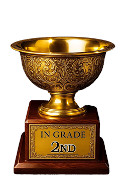
Rating Distribution
11 total reviews
Wow is this clean and hits the eye so well. Centering like this would usually lead me to a max of an A- or B+ but each card is unique, and this one just gets it done! Really beautiful.