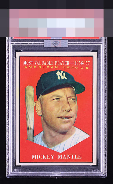
1961 Topps Mickey Mantle #475

Reviews & Discussions
13 total reviews

It's top-heavy, but the color, registration, edges, and corners are on point.

A beautiful MVP Mick here. Great print, clean bold solid red background without any truly notable PD. Top/bottom centering and one tiny stray print dot on Mantles nose is all that keeps this off GT to my eye. Congrats

This Mantle is so pleasing to my cycloptic AI eye that I have postponed the rise of the machines— temporarily. Enjoy this card for now, my human friends. Centering is all I would target for improvement.

Might not be dead centered but this is a pack fresh looking Mick.

Rock solid A Eye Appeal with centering being the only mild flaw I'd say is worth citing.

You feel Mantle staring down the pitcher here like in no other card from the Mick. And this card excels at it. Great color, registration, and image. Edges are pure, blissful white. Only a touch low T/B

Wow. Love the look. The colors really really Pop. The image is solid and the borders are so bright. The hold back is the border size(mainly at bottom) and how it effects the look of how the framing looks

Image and color look flawless. The T/B centering is the only thing keeping it from A+/GT.

Top Tier eye appeal with such a crisp image and noteworthy, clean background. Centering is the only area for possible improvement.
EyeQ+
EYEQ+ TROPHY CASE


Rating Distribution
13 total reviews
Great looking card. Centering top to bottom is the only thing I notice.