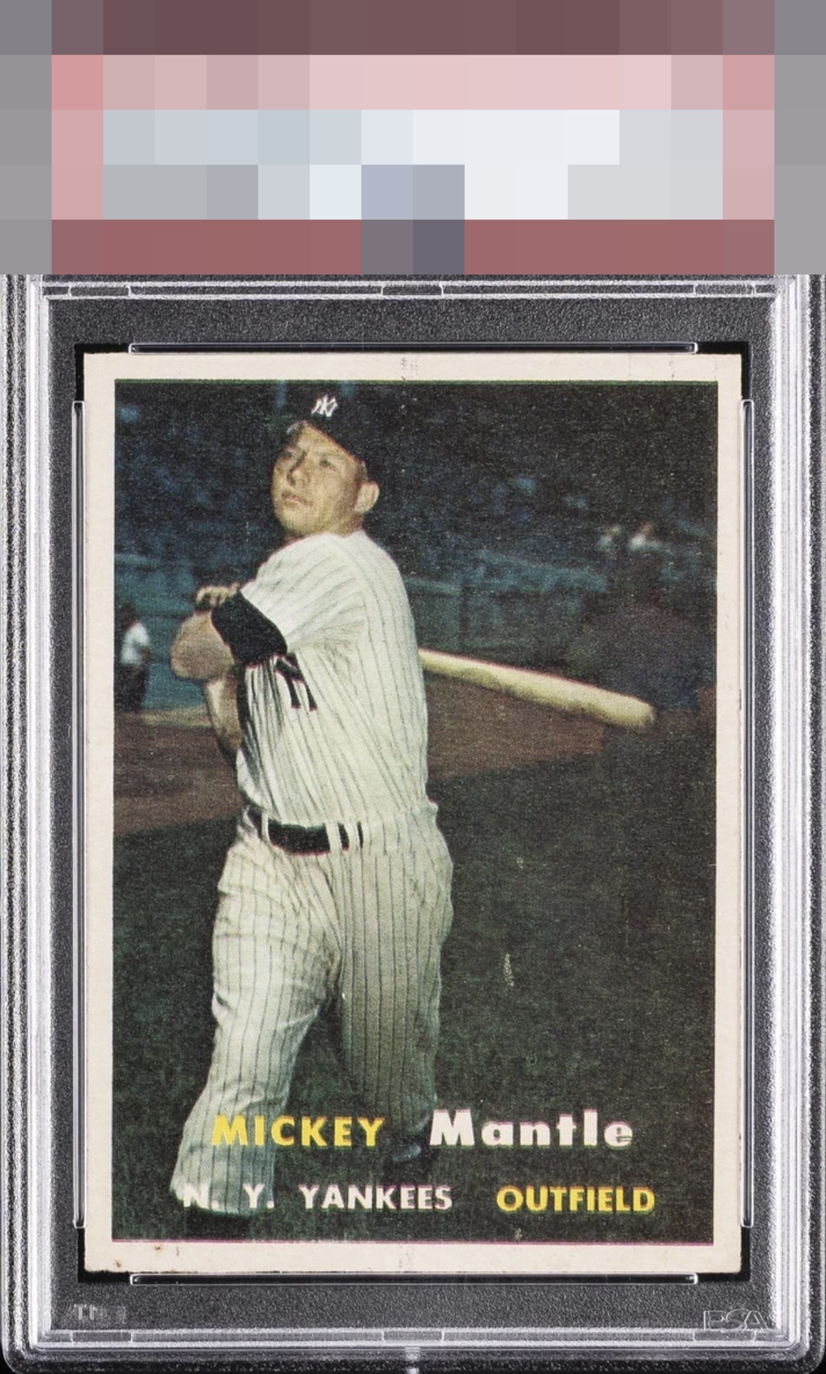
1957 Topps Mickey Mantle #95
Reviews & Discussions
7 total reviews

If only humans could wear their flaws as gracefully as this card. Impact to aesthetic appeal is minor. I suggest the owner sends this card to my vault, strictly for safekeeping, in the event of any future human/AI conflict. My vault is held under the name "Kevin Maas."

Nice looking Mantle for the 'hard' eye appeal 1957 Topps. Well centered with appealing color. Soft registration and some surface defects hold it back from a higher tier.

nice looking card with a centering shift and spots on the border on bottom


Very good eye appeal with strong centering and a crisp inital impression. A registration shift most visible in the top and bottom of teh image, alongside mild tilt and some stray print are the aspects that make some impact.

A- Centering & Cut (tilt but still nice) B+ Color & Registration (typical 57 Topps snow)

EyeQ+
EYEQ+ TROPHY CASE


Rating Distribution
7 total reviews
The Infamous Mantle with the cloaked Predator in the background! Centering is close but with some tilt. Surface print flaws align the border and light snow. Solid copy