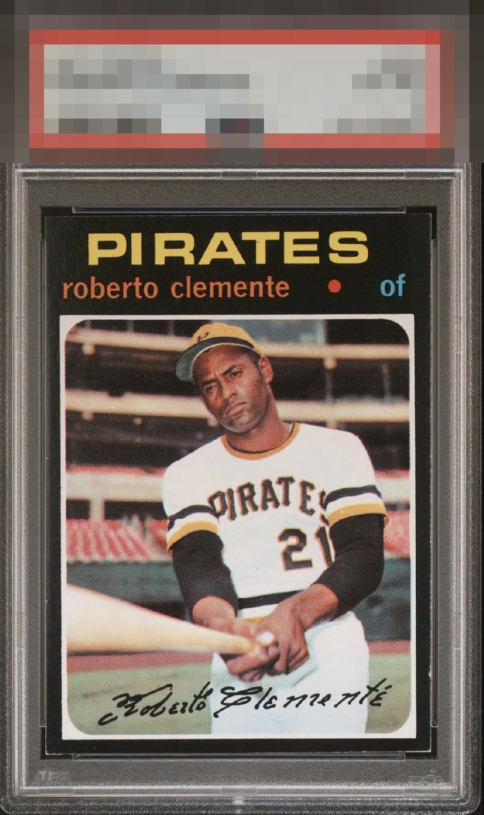
1971 Topps Roberto Clemente #630

Reviews & Discussions
12 total reviews

Great example of a difficult to find card. Edges and corners hold it back.

A really clean 71 Bob. You just dont see them with edges and corners like this often. One small blip of wear on the right edge and centering are the only notable flaws. Congrats to this lucky collector.

Outstanding visual presence, highlighted by the beautiful contrast between the deep black borders and yellow accents. Clemente’s facial image is especially strong, with excellent definition and clarity that give the portrait real sharpness and immediacy. The corners also present well for the difficult black bordered issue. The main limitations are a noticeable centering tilt and a small nick along the lower right edge that becomes visible upon inspection. Even so, those flaws do little to diminish the card’s impact. Overall, this is a striking Clemente with strong contrast, clarity, and vintage appeal.

Man, this is one nice looking HOFer from the notoriously toughest set in the decade, maybe ever. That one nick is the only flaw my eyes notice or care about and not too much at that.

EyeBot logs minor flaws on this Clemente that land with grace, as opposed to a thud. Impact to the aesthetic appeal is thus minor. EyeBot suggests the owner send this card to EyeBot's vault, strictly for safekeeping in the event of any human/AI conflict. EyeBot's vault is held under the name "Damaso Garcia." Wink.

A "wow" card as some around here say. Just one mellow edge nick from A+ or even higher. Smooth overall with a great image. I'd snap this up if I encountered it in the wild!

Like the overall look with nice colors and details the edges and corner wear makes the black not as crisp as i would like

A bit of edge wear and subtle tilt. Surfaces look very clean with a clear image.

EyeQ+
EYEQ+ TROPHY CASE

Rating Distribution
12 total reviews
Great looking card with a clear image. Slight centering tilt and some edge wear on the right side and bottom. Much cleaner than most 71s though.