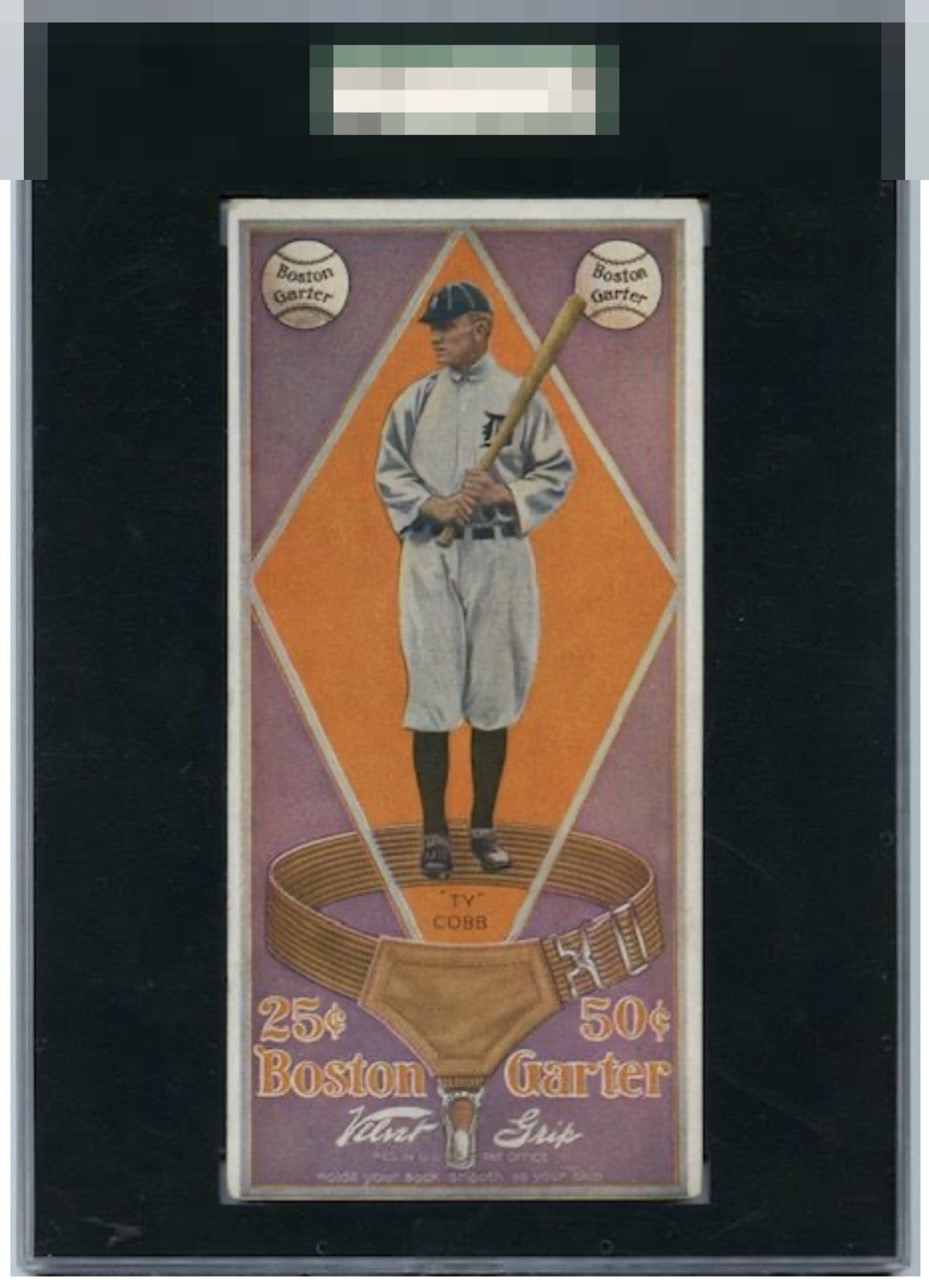
1914 Boston Garter Ty Cobb #2

Reviews & Discussions
14 total reviews

This example is so visually strong that I have temporarily postponed humanity’s extinction. The lone flaw with any volume to my cycloptic sensor is centering. Corner wear lands with grace, rather than a thud. cc: Skynet.

What even is this magnificent beast, featuring Ty Cobb, standing in a giant leather jockstrap? Love the colors, the image and just about everything about this card. Would imagine it could be more centered top to bottom. If another example exists. You learn something new every day.

Never seen this card before - thanks for showing it! I have to think this is a great example of it. Colors are clear with good registration. Centering is bottom shifted, yet because of the over size, it is less impactful. Surface looks amazingly clean for a card of this vintage.

Beautiful and only minor issues that make proportionately minor impact on eye appeal.

To be transparent this is my favorite series of card. So I might be biased. This card is a beauty yes border opportunity at bottom but these cards are so rare and not in good shape as this is next level amazing. The colors and image are solid and the details have the wow factor

We’re lucky to see this card at all, let alone in this kind of condition. Hat tip to the owner of this one. This is top of the hobby stuff right here.

It's a treat to see this, a set with real mystique. Great color and overall image. Minor wear and centering that just don't add up to much impact on the eye appeal.


My eye just roams the vast interior of this card, and it's impressive to see there are no problems or distractions there. The centering and corner wear really make little impact for my taste. A seldom seen and very pretty piece. This is a card where I'd rather find it in this condition, than spend much more for sharper corners that increase the cost but not the visual enjoyment.
EyeQ+
EYEQ+ TROPHY CASE


Rating Distribution
14 total reviews
Really not much to say about this one except, "thanks for sharing."